Introduction
Want to get a modem, consistent and great looking sparking user experience and visual design? Why not take a look at the latest version 10 of the Carbon Design System with guidelines and resources from the IBM Design Language.
This article presents a practical example of some of the highlights in the Carbon Design System and brings a pragmatical approach to a modernization task. In this example, I use my rather simple portfolio website to apply Carbon-styling to an existing interface. I also demonstrate some of the basic elements of Carbon to help you get started.
First, we will overview some of the Carbon Design System basics like colors, icons, typography, and layouts. We will then look at some practical examples of applying the Carbon 10 resources to an existing visual design. The article also shares a new few links to references and reusable LESS/CSS and Sketch resources.
Great, let’s look at how Carbon can provide a foundation for a sparking carbonized design.
Carbon Design System and the IBM Design Language
As mentioned above, Carbon is an open-source design system built from the following guiding principles
- Open for anyone to use and contribute
- Inclusive of all, regardless of ability and situation
- Modular and flexible in use
- Putting the user first
- Builds consistency by ensuring a consistent experience
The Carbon design system includes guidelines on the principles of the design, like color, themes, icons, typography, and layout. This article will discuss the application of these principles. Carbon also provides set rich set of key component building blocks designed and coded for a specific UI problem or purpose. The 30+ components and the principles are designed to seamlessly interact with the bigger consistency of the experience. The components are provided in the Carbon Design Kit, including Sketch libraries and React and Angular UI components. Additionally, Carbon also provides patterns as best practice experiences as combinations of components that address common user objectives with sequences and flows, like dialogs, notifications, filtering, and search.
In this article, my focus will mainly be on the experience and visual aspects of applying Carbon.
To explore more on the Carbon Design Kit resources, visit www.carbondesignsystem.com.
Colors
The selection of colors creates uniqueness. Carbon provides balanced and harmonic color anatomy. Colors are provided as base color palettes, themes, and as tokens for a consistent user experience.
Let’s start with the color palettes. Carbon defines a natural gray and 7 color families; Green, Teal, Cyan, Blue, Purple, and Magenta. Each color family is given as 10 values, ranging from light to dark colors, for example, Blue-10, Blue-20, .. Blue-100. Additional single action colors values are provided in Red, Orange, Yellow, and Green. The Blue and Grey color palettes and the corresponding HEX color codes in LESS syntax for Blue are shown below.

@blue-100: #051243;
@blue-90: #051b75;
@blue-80: #0530ad;
@blue-70: #054ada;
@blue-60: #0062ff;
@blue-50: #418cff;
@blue-40: #6ea6ff;
@blue-30: #97c1ff;
@blue-20: #c9deff;
@blue-10: #edf4ff;
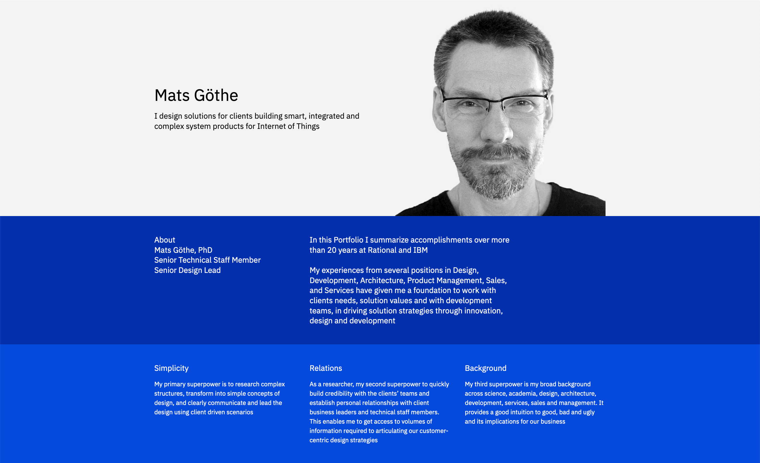
The visual design discussed in this article mainly uses gray and blue color values. The grey colors in the design come with the White theme that we will discuss later. The blue colors come from selected accent colors in the design.
Themes and Tokens
Carbon uses tokens and themes to manage color to achieve a consistent experience and visual design. There are two light themes and two dark themes; White, Gray 10, Gray 90, and Gray 100. The design in this article is using the White theme.
To achieve a consistent experience, Carbon defines tokens as code identifiers for a unique role or set of roles in the design. Tokens are universal and identified by a name consistently used across the themes. For example, a page background is defined by the `@ui-background` value. In my White theme, this takes the value `#fffff`. In the dark Gray 100 theme, it would take the value `#171717`.
There are multiple other roles defined for the experience. For example primary, secondary, and tertiary buttons. Backgrounds for primary, low, and high contrast containers. Primary, secondary and tertiary texts, and texts for error messages and links and hovers. And the list goes on … Check the details on www.carbondesignsystem.com/guidelines/color/usage.
In applying the Carbon White theme I used a LESS stylesheet that defines the colors and tokens and sets the values for the White theme used in the design. A code snippet of the LESS definitions is exemplified below. The portfolio design example discussed in this article, mainly uses the ‘ui-background’, ‘text-01’, ‘link-01’, ‘ui-01’, ‘ui-03’ and ‘interactive-01’ tokens.
// Core color tokens
@ui-background: @white; // Default page background.
@interactive-01: @blue-60; // Primary interactive color. Primary buttons
@interactive-02: @gray-80; // Secondary interactive color. Secondary button
@interactive-03: @blue-60; // Tertiary button.
@interactive-04: @blue-60; // Selected elements. Active elements. Accent icons.
@danger: @red-60; // Danger button background.
@ui-01: @gray-10; // Container background on @ui-background. Secondary page background.
@ui-02: @white; // Container background on @ui-01. ‘Light’ variant background.
@ui-03: @gray-20; // Subtle border. Tertiary background.
@ui-04: @gray-50; // Medium contrast border.
@ui-05: @gray-100; // High contrast border. Emphasis elements.
Layout and Spacing
Carbon defines a spacing scale as useful when laying out individual components. It includes a range of large to small increments to create the appropriate relationships for detail-level layout designs.
@spacing-01: 2px;
@spacing-02: 4px;
@spacing-03: 8px;
@spacing-04: 12px;
@spacing-05: 16px;
@spacing-06: 24px;
@spacing-07: 32px;
@spacing-08: 40px;
@spacing-09: 48px;
#portfolio-headline {
background: @ui-01;
color : @black;
margin-top: @spacing-05;
}

#portfolio-headline-name {
.expressive-heading-05();
margin-bottom : @spacing-05;
}

#portfolio-headline-quote {
.expressive-heading-03();
}
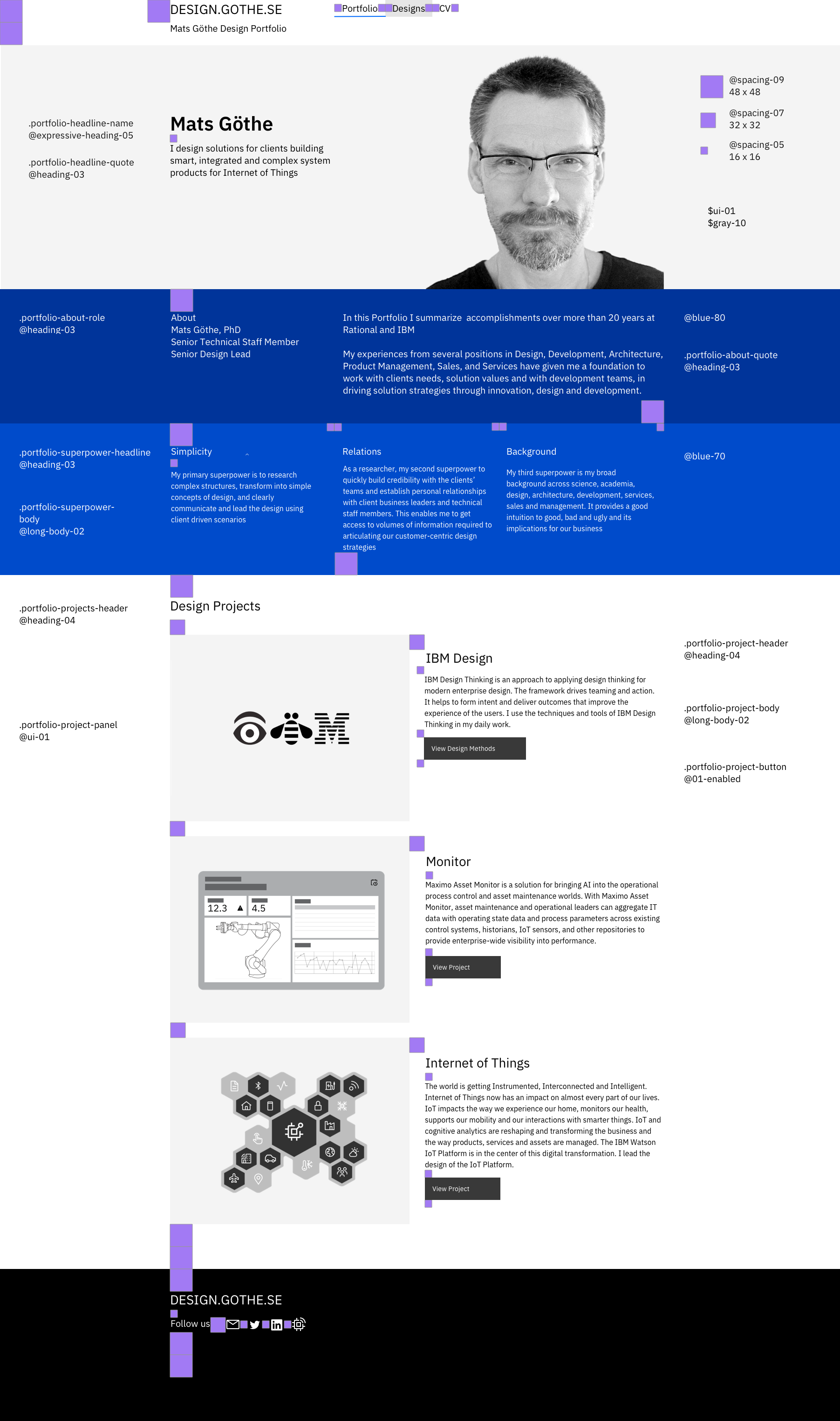
Here I find that using Sketch with the Carbon library to comes handy when creating and testing the carbonized design. The layout can be defined using spacing components that guide the implementation of margins and padding’s on the individual components on the page designs. The design below shows the layout in Sketch of the home portfolio page with inserted Carbon `@spacing-09`, `@spacing-07`, and `@spacing-05` spacings. The Sketch design guides the final coding of the styling using the LESS stylesheet declarations implementing the component spacings.
Typography
Carbon uses type tokens to define the typography. A type token is a pre-set style with typographic elements such as font size, weight, and line height. The typography is calibrated for use with the open-source IBM Plex typeface.
Download IBM Plex from the IBM Plex Github Repo. github.com/IBM/plex
IBM Plex is also available directly for use through Google fonts.
Carbon defines typographies for two situations. Productive typography for product and web designs. The Expressive typography for web, graphic, and print usage extends the Productive design with more dynamic typographic hierarchies and more variety with a fluid Heading scale. My carbonized design portfolio will use Productive design typography.
The Carbon design kit provides the type tokens in the Sketch library. The type tokens can be defined in LESS to simplify the style coring.
.body-long-01 {
font-family: 'IBM Plex Sans', sans-serif;
font-size: 14px;
line-height: 20px;
font-weight: 400;
letter-spacing: 0.16px;
}

.body-long-02 {
font-family: 'IBM Plex Sans', sans-serif;
font-size: 16px;
line-height: 24px;
font-weight: 400;
letter-spacing: 0px;
}
Responsive design
Carbon defines fluid types for headings using 5 breakpoints across screen widths. The LESS definition uses these breakpoints in the header type definitions to implement the fluid types.
@sm: ~"(min-width: 320px)";
@md: ~"(min-width: 672px)";
@lg: ~"(min-width: 1056px)";
@xlg: ~"(min-width: 1312px)";
@max: ~"(min-width: 1584px)";

.expressive-heading-03 {
font-family: 'IBM Plex Sans', sans-serif;
@media @sm {
font-size: 20px;
font-size: 18px;
line-height: 26px;
}
@media @md {
font-size: 20px;
line-height: 26px;
}
@media @lg {
font-size: 20px;
line-height: 26px;
}
@media @xlg {
font-size: 20px;
line-height: 26px;
}
@media @max {
font-size: 20px;
line-height: 26px;
}
font-weight: 400;
letter-spacing: 0px;
}
Icons
Carbon provides a super-rich set of icons and pictograms for visual design consistency. Check out the icons at www.carbondesignsystem.com/guidelines/icons/library. Using icon library you can view and filter and then download the icons you need directly from the library.
In the Carbon design example, I only use a few icons from the library for page browsing, downloads, and social media. The Up Right Arrow icon is used to indicate a navigation link to related articles. The Download icon for shared file-based material.
Putting it all together
We have now explored some of the fundamental visual elements of the Carbon Design System; Colors, Themes, Spacing, Typography, and Icons. Note that Carbon Design System provides many more advanced elements for web, product, and digital designs, like Components, Patterns, and Data Visualization. View it all on www.carbondesignsystem.com.
Let’s close this article with a few conclusions, examples, and references on how to get this all together into a carbonized design. I find that Sketch and the Sketch library available with Carbon provides a great help in expressing, specifying, and testing the design. Down to a pixel-perfect implementation. The Carbon library provides a direct selection of the design elements like colors and components directly in the Sketch tool. Using a LESS stylesheet, in combination with any existing CSS / LESS stylesheet from an earlier design is a great way to incrementally lay the carbon design over en existing implementation. Then drive additional style changes or redesigns from there. All in all, the experience becomes guided, practical and productive. And providing a consistent experience.
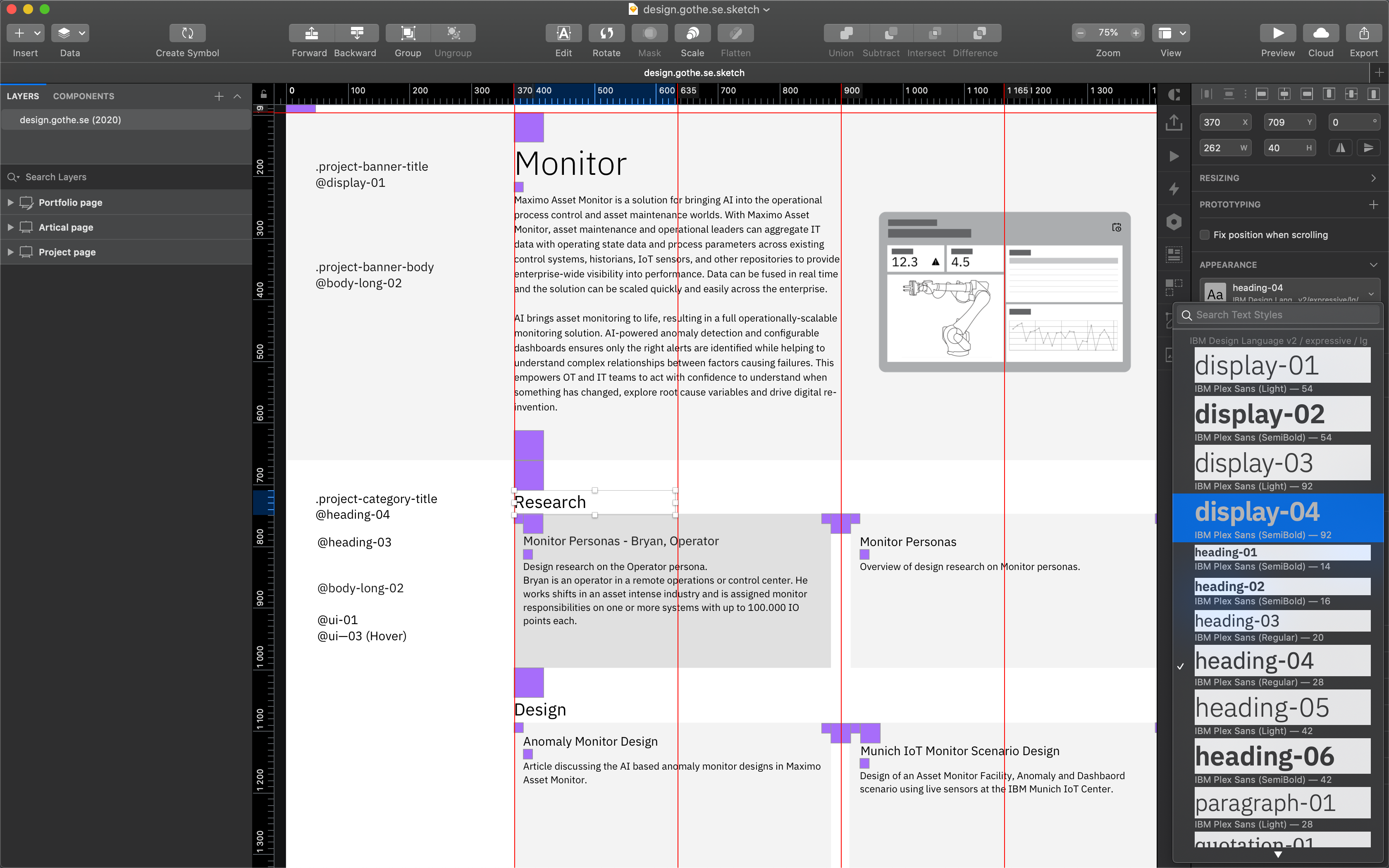
A few simple examples of designs of portfolio, project, article, and session pages are provided below. These designs use Sketch and combine the definition of LESS/CSS and Carbon theme style classes for each design element. It also defines the layout using the Carbon spacing sizes in units of 48, 32, and 16 px.
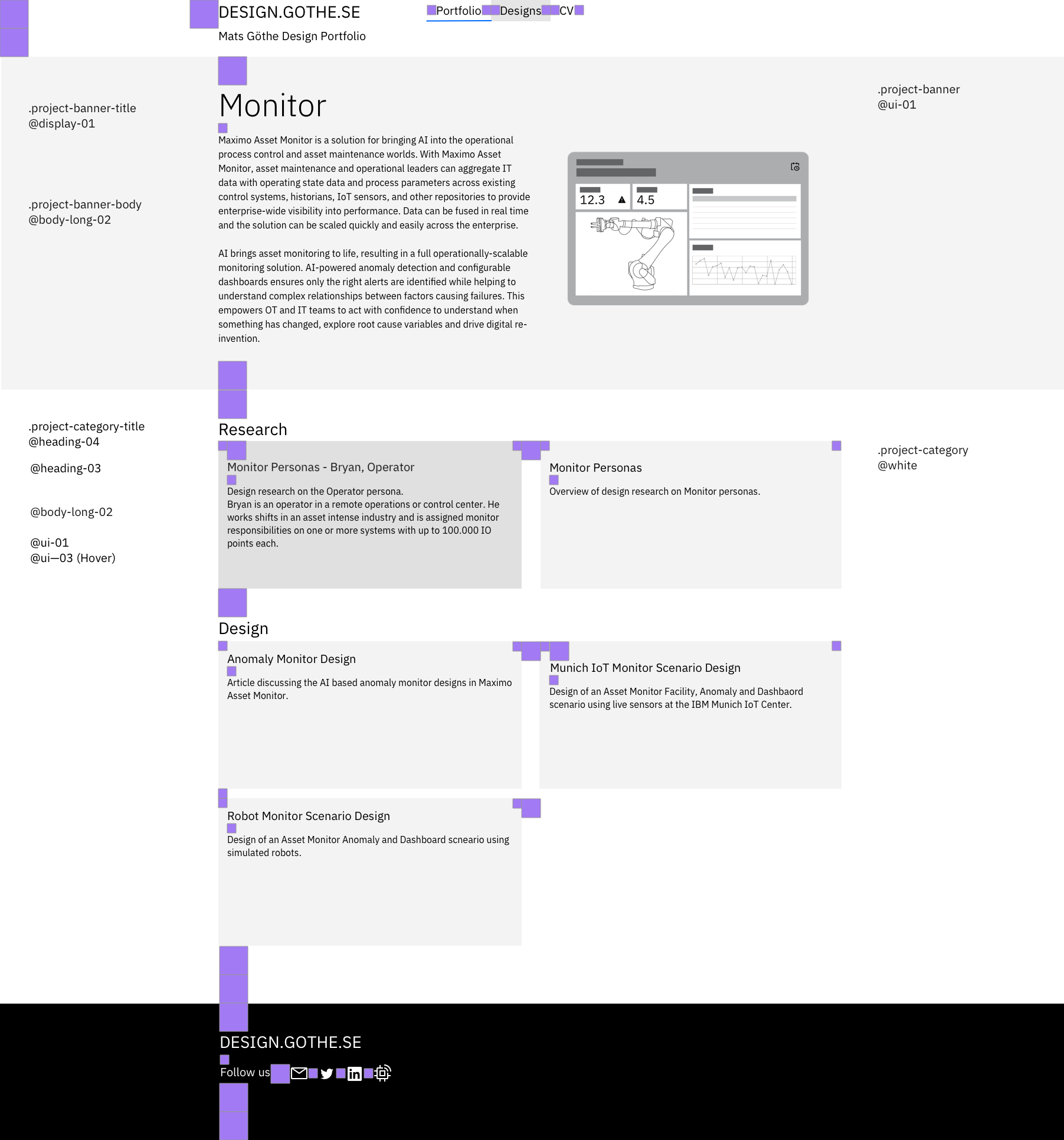
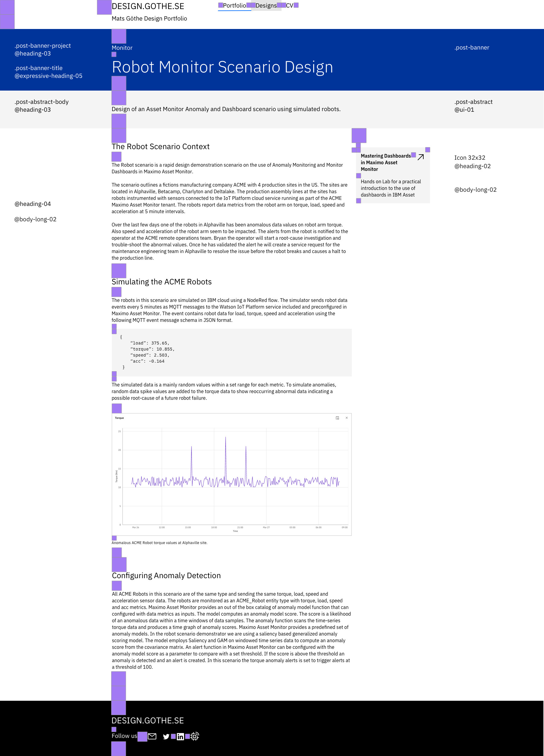
Carbon Design System at and across enterprise scale
Carbon is IBM’s official design system and serves a wide range of designers and developers building digital products and experiences. View examples of applying the Carbon Design System to enterprise-scale product, digital, and event designs at IBM on carbondesignsystem.com.
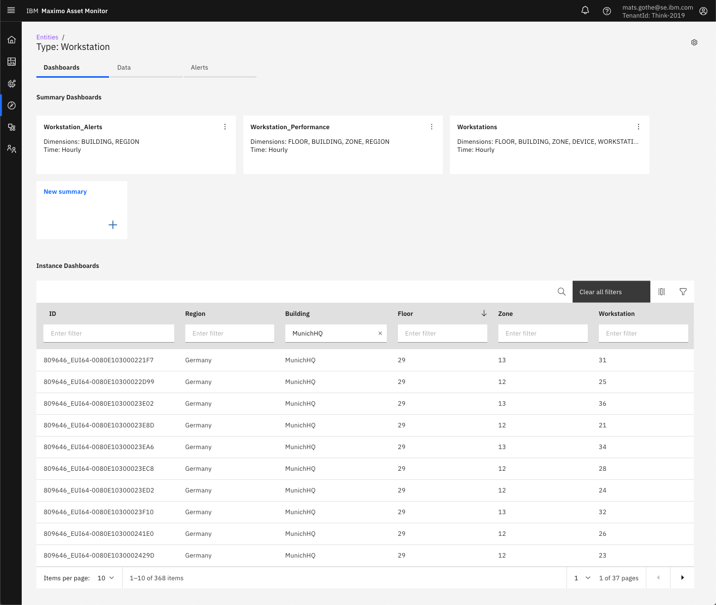
Carbon is the foundation and design language for product design of AI applications and the Internet of Things at IBM. The two examples below exemplify the use of the principles discussed above and the use of components and patterns from the Carbon Design System in IBM Maximo Asset Monitor product designs.
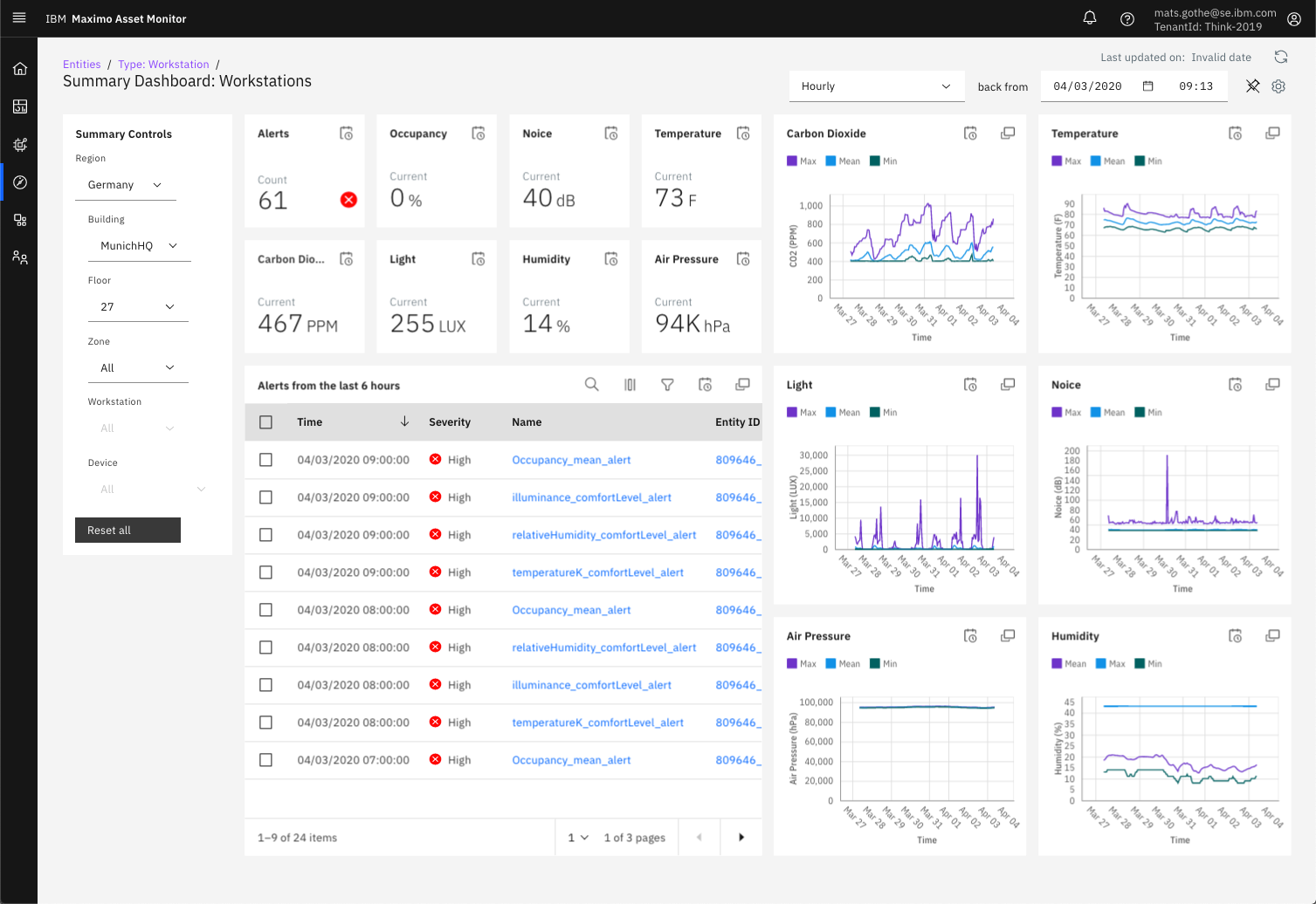
Visit my portfolio at design.gothe.se for additional exemplifies in the use of Carbon in our product design of AI applications and Internet of Things at IBM. And look luck in creating web and product designs using Carbon.
Mats Göthe, PhD
STSM, Senior Design Lead
Maximo Asset Monitor
AI Applications, IBM
Download Carbon 10 LESS stylesheet
Download Sketch file
